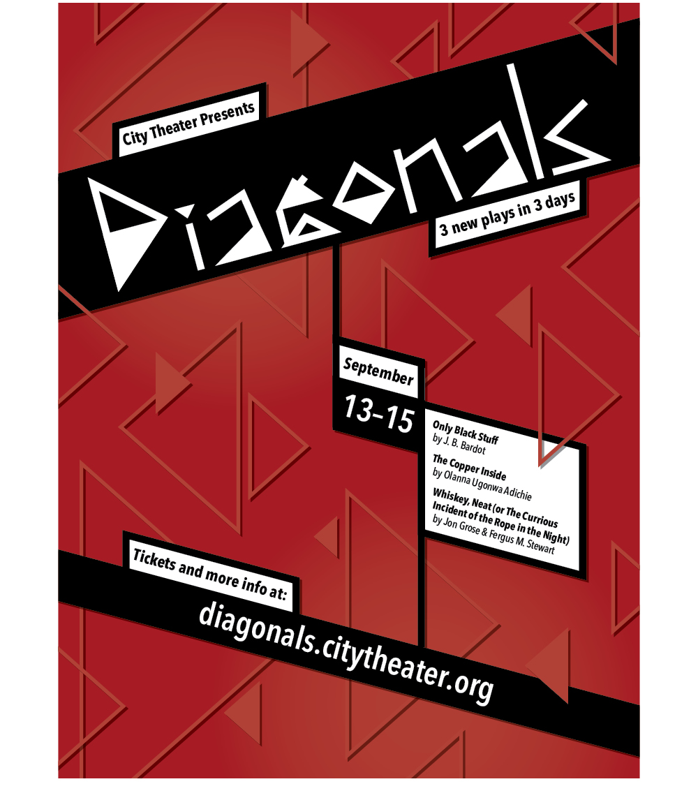
Diagonals poster; the triangles are the same shape as the "D".
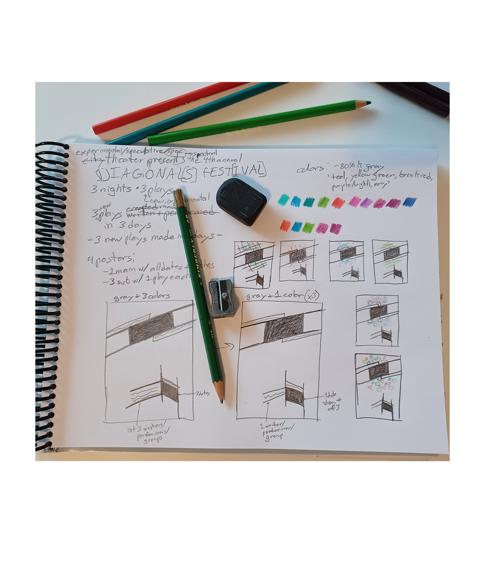
Early layout sketches and brainstorming.
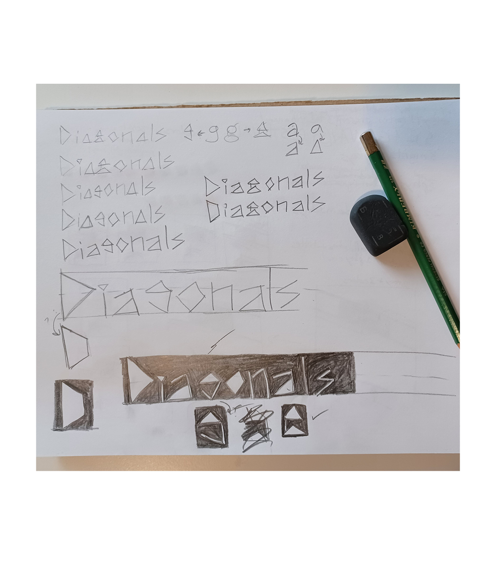
Lettering sketches.
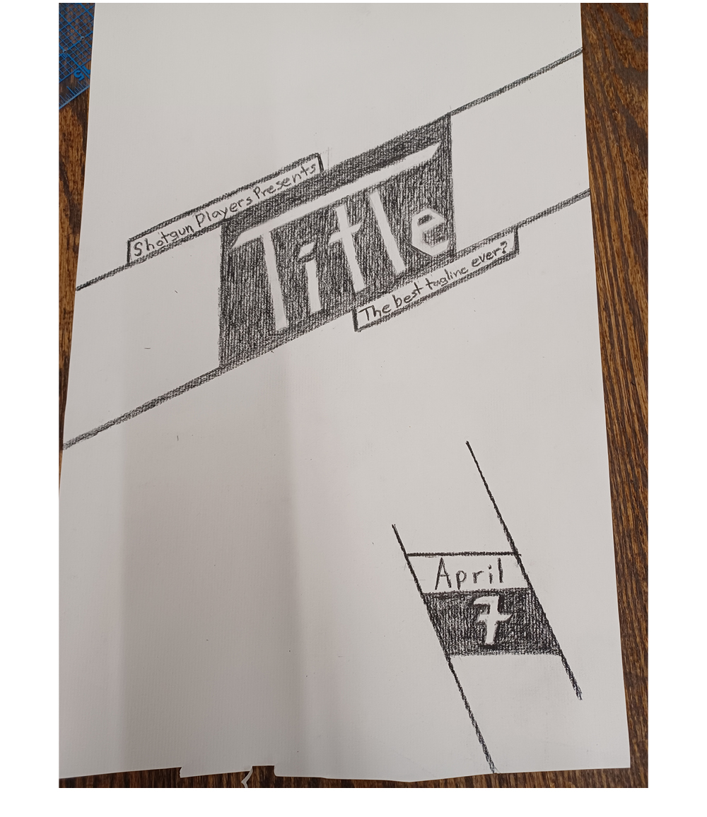
The genesis of the project; poster from the "Break it Down" event.
Diagonals Festival Promotion (in progress)
For a long time I've had an itch to design something with text set at an extreme angle, so when a local theater hosted a poster-making event as part of their "Break it Down" series, I took advantage of the opportunity.
Once was not enough, so I'm expanding the concept into an advertising campaign for a theater's bold festival of new, experimental plays.
With the poster layout largely established from the original concept, I created lettering for the title that matched this energy and continued the angular theme.
Now that the poster is done, a mailer/postcard and website design are next!